Dev Dash — AI Command Center
A unified AI-powered command center that puts every team — PM, Engineering, DevOps, Security, and Database — on the same page, in real time.
Overview
Project Overview
Dev Dash is a concept product designed and built to demonstrate a full "Design, Development & Deploy" capability — a full-stack AI-powered command center that consolidates the fragmented tooling chaos modern engineering teams live in.
The product surfaces a single unified workspace where a PM, lead developer, DevOps engineer, security team member, or DB schema expert can track feature progress in real-time, monitor infrastructure health, respond to security events, review schema migrations, and coordinate team activity — all through a conversational AI interface.
The design challenge was to handle extreme information density — five distinct roles, multiple live data sources, multi-state workflows, AI-generated actions — without the UI becoming overwhelming or unintelligible.
Problem
Engineering Teams Are Living in Too Many Tabs
A typical engineering team at a scaling startup runs at least six tools simultaneously: Jira or Linear for tasks, GitHub or GitLab for PRs, Datadog or Grafana for infra, PagerDuty for alerts, Notion for specs, and Slack for everything else — with no single source of truth tying them together. And that's before you factor in the DB schema expert waiting on migration approvals, or the security team flagging issues that were already merged two sprints ago. Context switching is not just annoying — it creates real delays in decision-making, missed incidents, unreviewed migrations, and security vulnerabilities discovered too late to fix cheaply.
Five specific pain points drove the design:
Feature progress is invisible across teams. Tracking a feature requires toggling between the task board, PR review, QA status, and spec docs — all in different tools. The PM sees one version of reality. The dev sees another. The security team isn't in the loop until it's too late.
Infrastructure incidents get buried in Slack noise. By the time the right person sees it, the blast radius has already grown. Reactive dashboards only show what's broken — not what's about to break.
Security flags surface too late in the release cycle. Security issues discovered after a feature is in staging are expensive to fix and almost always get deprioritized under sprint pressure.
DB migrations are invisible to non-engineers. Schema changes live in pull requests that PMs and security reviewers never see. Migrations get merged without awareness of downstream impact — until something breaks in production.
No one has the same context entering a standup. Every team member walks in with a different mental model of what's done, what's blocked, and what's at risk. The standup becomes a sync exercise rather than a decision-making session.
Approach
Design Approach
Starting From Role Mental Models, Not Feature Lists
Before opening Figma, I mapped the core mental models for each of the five roles — PM, Lead Dev, DevOps, Security Engineer, DB Schema Expert — and identified the "3 questions each role asks every morning":
PM
What's blocking shipping? What's the sprint risk?
Lead Dev
What needs my review today? What broke overnight?
DevOps
What's the infra health? Is anything about to fail?
Security Team
What new flags need review? What shipped without clearance?
DB Schema Expert
What migrations are pending? What schema changes are unreviewed?
The navigation architecture emerged from this: Home (unified task triage), Projects (kanban + sprint), Feature thread (AI-assisted spec-to-ship flow), Infra (topology + forecasting), and DevOps & Security (event stream + SOP playbooks).
Information Hierarchy Over Minimalism
This wasn't a case for minimal design. Dense, expert tools need high information density — the goal was to make that density legible, not to strip it away. I used a consistent visual grammar: status dots (green/amber/red), inline contextual panels, and progressive disclosure (collapsed rows that expand to full detail) to make the interface scannable at a glance without hiding critical data.
All Five Roles, One Thread
The most important design decision in Dev Dash: the feature thread is multi-role by default. When a feature is in development, the thread surfaces QA feedback and blocking issues, security audit results with unresolved flags, pending DB migrations with reviewer status, infra impact and deployment readiness, and acceptance criteria progress — all in one place. Everyone's signal lives in one thread. No one has to ask for an update. No one can claim they weren't in the loop.
AI as a Collaborator, Not a Gimmick
The AI agent thread in the Feature view ("Dev Dash AI") was designed to feel like a senior team member that ships code and surfaces issues — not a chatbot. The agent generates preview environments automatically on each build, runs the full test suite and surfaces failures inline, flags security vulnerabilities, tags pending DB migrations that need schema expert review, surfaces SOP playbooks for DevOps incidents, and keeps a live audit trail of every decision by role. The conversational thread structure deliberately mirrors how real dev teams communicate in Slack, making the AI feel embedded in the workflow rather than bolted on.
Screens
Key Screens Designed
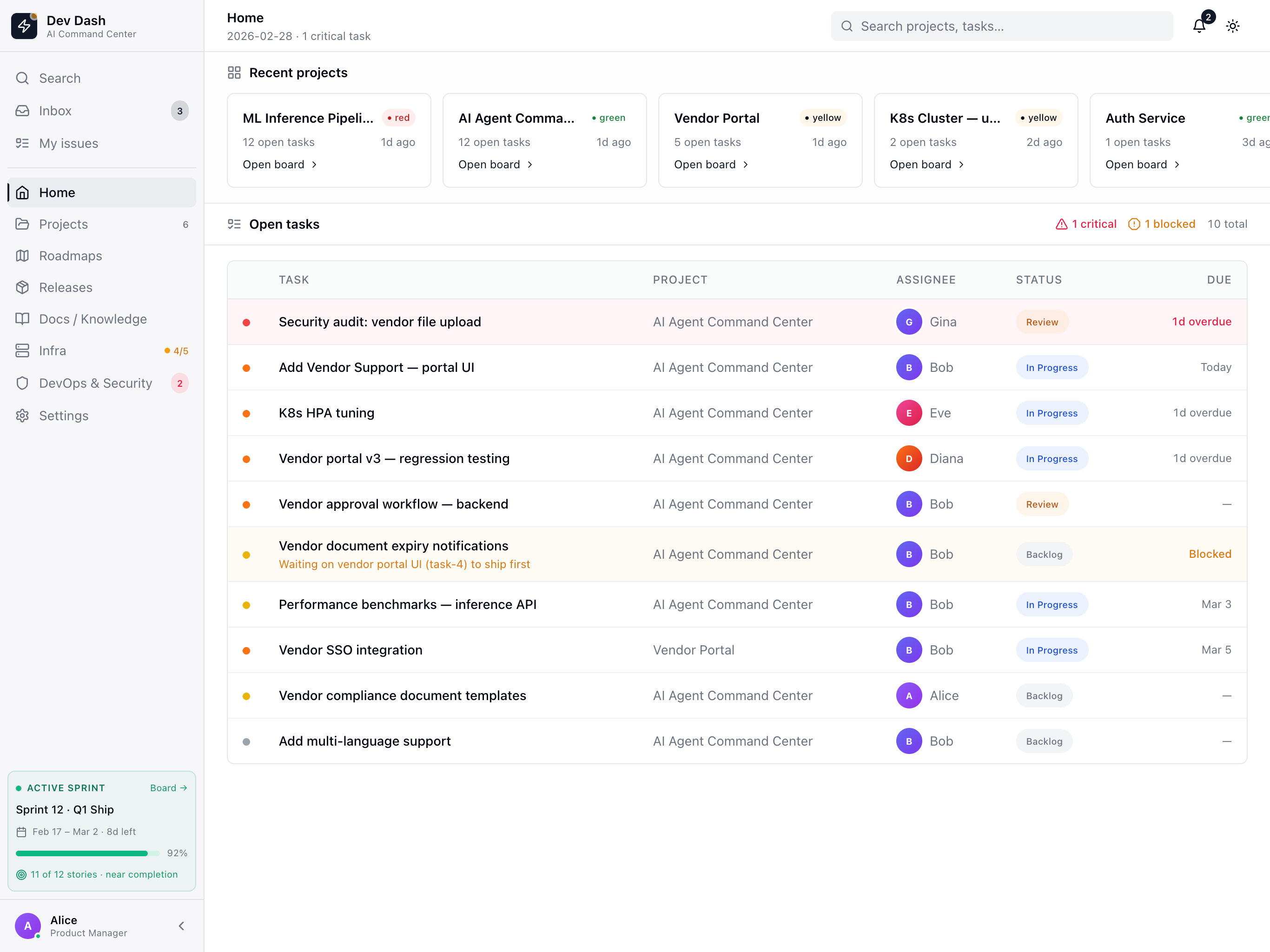
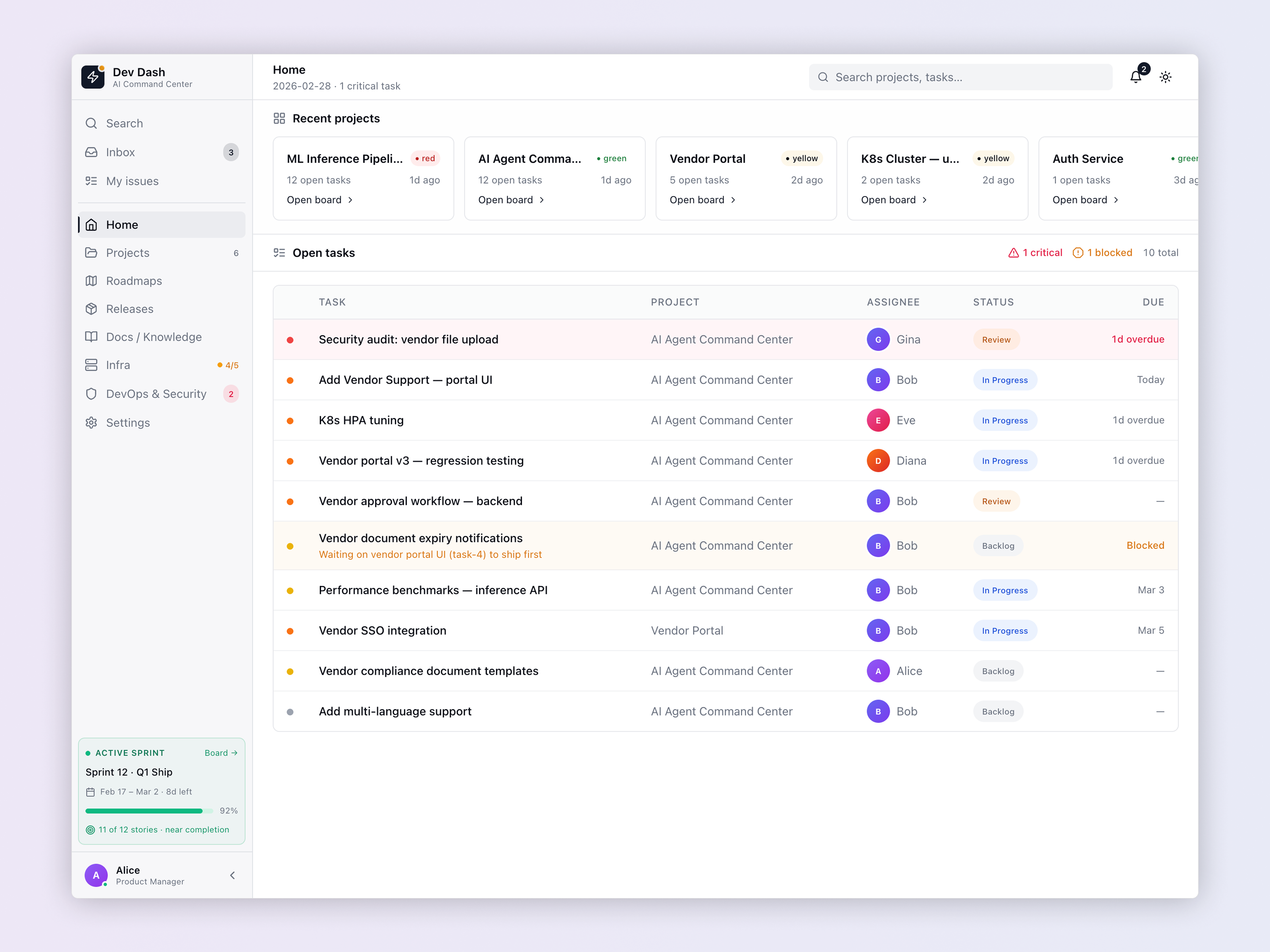
Home — Unified Command View
The Home screen is the daily triage surface for every role. It leads with Recent Projects in card format showing live status (red/yellow/green health), open task count, and last-active timestamps. Below, the Open Tasks table prioritizes work by urgency — critical tasks surface to the top with overdue indicators, blocked tasks show their dependency inline, and each task is tagged with its assignee role. The key design decision: show the blocked dependency reason inline. When a task reads "Waiting on vendor portal UI (task-4) to ship first," every role — PM, dev, security, DB — can see the blocker without pinging anyone. The sidebar sprint widget gives persistent sprint health context regardless of which screen you're on.
Feature View — AI-Assisted Spec-to-Ship Thread
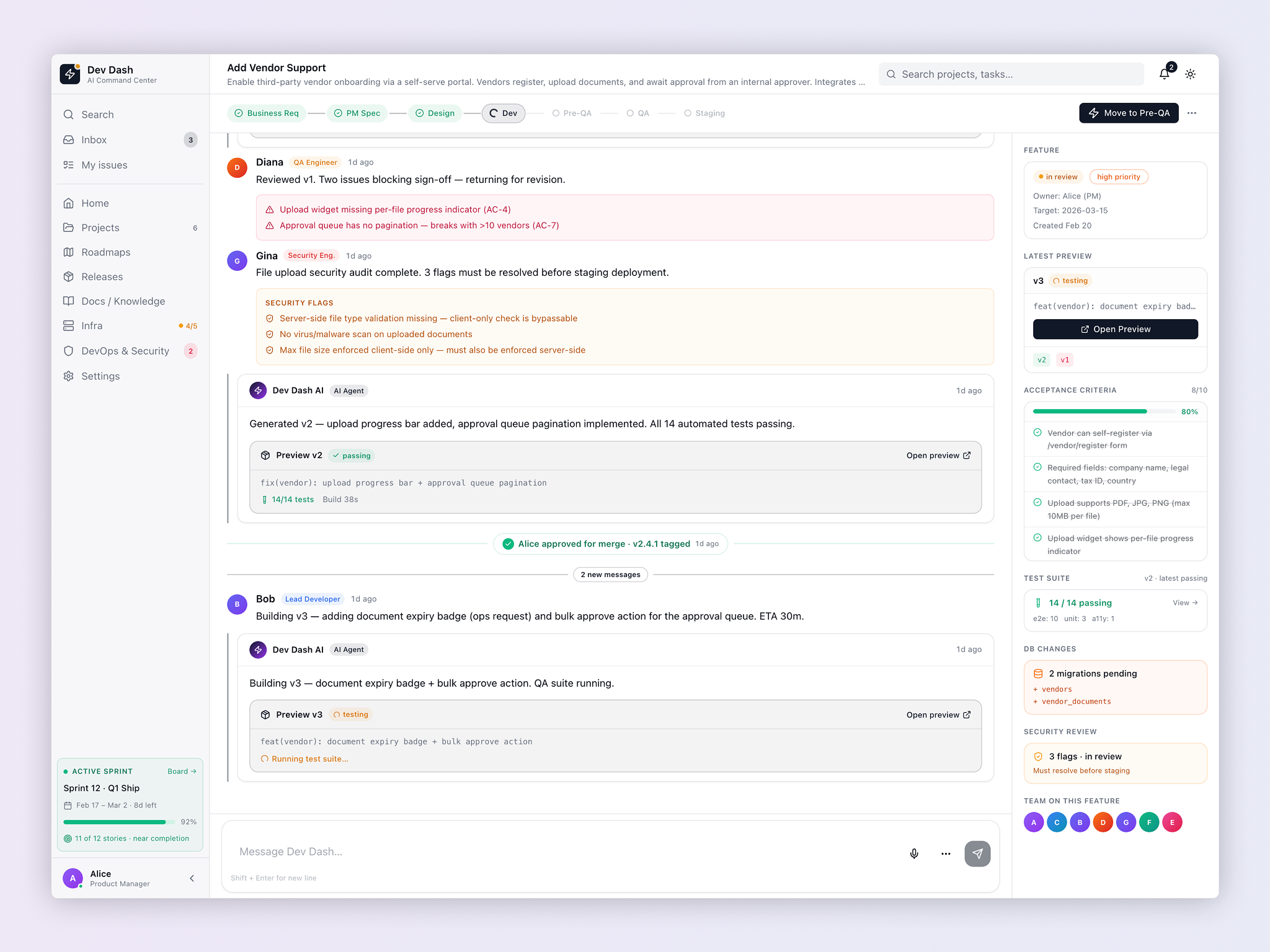
This is the centerpiece screen — and the one that most directly addresses the multi-team alignment problem. The feature view renders the entire lifecycle of a feature as a multi-role threaded conversation: QA feedback, security audit results with unresolved flags, AI-generated code previews with test results, DB migration notices, and approval events — all in one scrollable thread, attributed by role. The right panel provides a persistent summary: acceptance criteria progress (8/10 complete), test suite status, DB Changes (2 migrations pending), Security Review (3 flags in review, must resolve before staging), and the full team roster. The DB Changes panel is intentionally prominent — surfacing schema migrations in the feature sidebar makes them visible to every stakeholder without a separate workflow. The Security Review panel with a "Must resolve before staging" gate is a design-enforced policy, not just a notification.
Projects — Kanban + Sprint View
The Projects screen provides the canonical kanban and sprint management surface, designed to be readable by all five roles simultaneously. Each project card surfaces the live status indicator, open task count, and last-active timestamp — giving PMs, leads, security, and DB experts a single-glance status read across all work in flight without drilling into individual project views. The status color system is consistent with every other screen — the same green/yellow/red grammar used in the infra topology appears here, making cross-screen context immediately legible.
Infrastructure — Live Topology & Forecasting
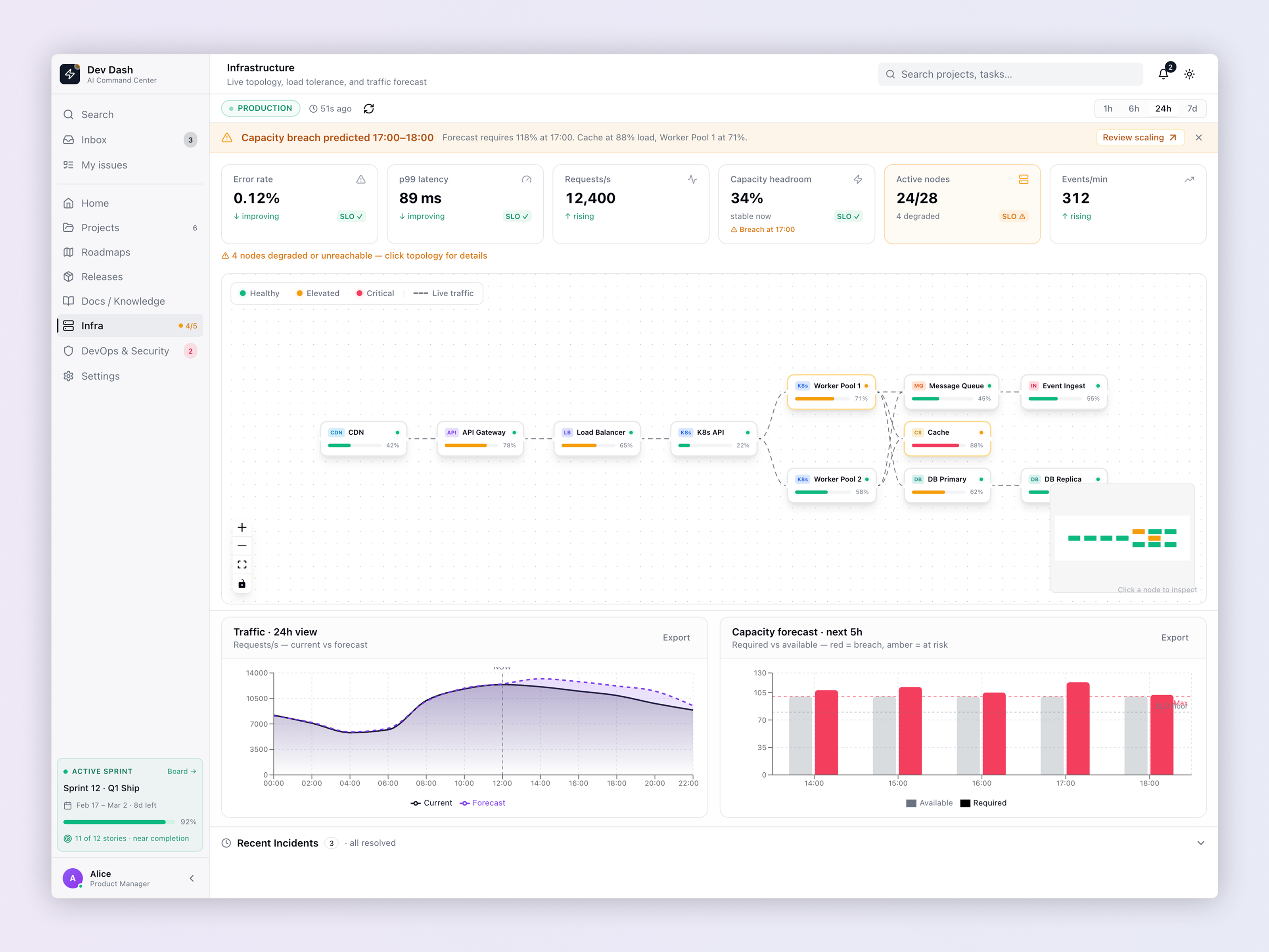
The Infra screen is designed primarily for DevOps, but intentionally readable by the PM and Lead Dev as well. It combines a live node topology graph with time-series traffic charts and a capacity forecast. The topology renders each service node — CDN, API Gateway, Load Balancer, K8s Workers, Message Queue, Cache, DB Primary, DB Replica — with its current load percentage and health status via color coding. The predictive alert banner is the critical design decision: it surfaces a capacity breach forecast before it happens — flagging "breach predicted at 17:00" with an actionable "Review scaling" link, a deliberate departure from reactive dashboards. The DB nodes are explicitly visible in the topology — schema migrations and replication lag are infrastructure events, not just database events, creating a natural coordination surface between the DB schema expert and DevOps when migrations are in flight.
DevOps & Security — Event Stream + SOP Playbooks
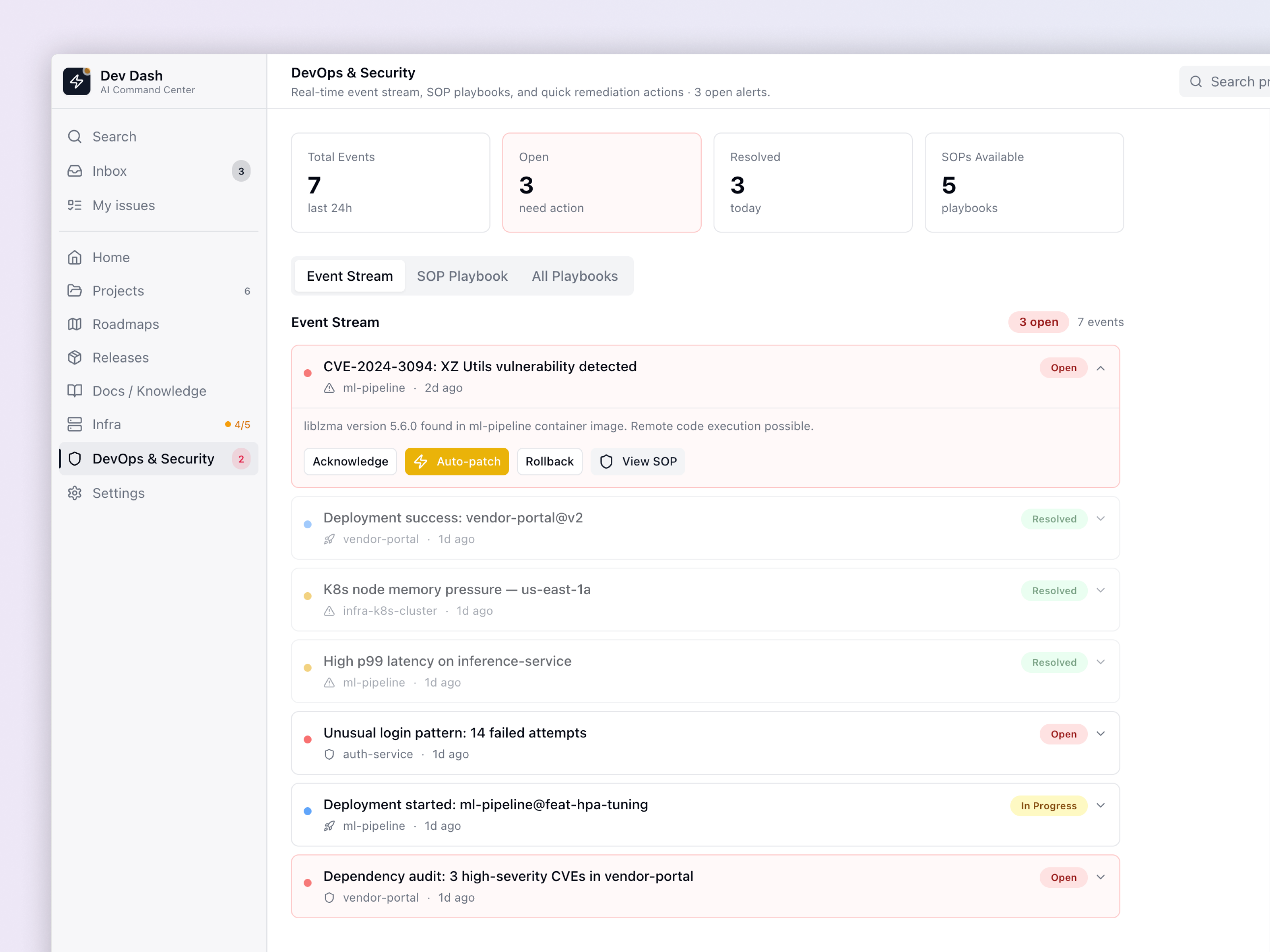
The DevOps & Security screen serves two roles simultaneously in a single unified event stream. Security and DevOps events are rendered together as a prioritized event stream with clear status labels (Open, Resolved, In Progress) — a CVE in a container image and a K8s memory pressure event are both operations concerns, and separating them into different tools creates the same fragmentation Dev Dash is designed to solve. Critical CVEs surface at the top with inline remediation actions: Acknowledge, Auto-patch, Rollback, View SOP. The Auto-patch action uses a high-contrast amber button to signal AI automation — available, but not the default, preserving human control and audit accountability. The SOP Playbook tabs allow teams to access documented response protocols without leaving the dashboard. The stats row at the top (7 Total Events, 3 Open, 3 Resolved, 5 SOPs Available) gives both DevOps and security leadership a snapshot they can report against.
Results
Design Outcomes
The design demonstrates three specific product design capabilities:
Complex system design
Mapping five-role, multi-state workflows into a coherent single-product experience without fragmenting into role-specific apps.
AI product design
Designing AI agent interactions that feel functional and trustworthy, not novelty-driven. The agent earns its place by doing real work, not generating summaries.
Design engineering
Every interaction state, loading state, empty state, and error state is accounted for. The visual language was built with production implementation in mind from the first frame.
Craft
Key Design Decisions & Tradeoffs
Thread metaphor over kanban for the Feature view — a threaded conversation maps better to how multi-role engineering teams actually communicate, and provides a richer, attributable audit trail than card-based task views.
DB Changes and Security Review are sidebar panels, not separate screens — moving them into the feature sidebar makes them part of the feature's definition of done, not afterthoughts discovered in a different tool. This is a structural design choice that enforces process.
Security flags gate staging — by design. The "Must resolve before staging" label in the Security Review panel is intentionally prominent and blocking. It's not a notification; it's a guardrail. Security clearance is treated as a first-class release criterion.
DB nodes are visible in the infrastructure topology — most infra diagrams omit database detail. Including DB Primary and DB Replica with their load percentages creates a natural shared view for DevOps and the DB schema expert during migration events.
AI agent actions are role-attributed and auditable — every AI action (generating a preview, running tests, flagging a migration) appears in the thread with a timestamp and type label. This is a trust and accountability design choice — you can always trace what the AI did and why, and which human approved it.
Flat sidebar navigation despite five roles — rather than role-switching or personalized views, the navigation stays flat and consistent. Every role sees the same structure, which means any team member can orient a colleague or hand off context without re-explaining the tool.
Start a Project
Want work like this
built for you?
Whether you need AI product design, SaaS strategy, or a complete product overhaul — let's talk.